
The Science of Vehicle Visibility: Make Your Brand Stand Out on the Road
THE SCIENCE OF VEHICLE VISIBILITY: HOW TO MAKE YOUR BRAND STAND OUT ON THE ROAD
Every business wants to get noticed — especially on the road. Whether you’re a restaurant delivering orders, a contractor driving between clients, a taxi service picking up passengers, or a local business building brand presence, visibility is everything. Mobile advertising works only when people can see, read, and remember your message while moving. That’s where the science of vehicle visibility comes in. Understanding how the human eye perceives motion, color, contrast, and distance can dramatically increase the effectiveness of your car signs, car toppers, and vehicle magnets.
At HTH Car Signs, we design signage based on real data — not guesswork. The goal is simple: to make your vehicle stand out instantly, even in traffic, from far away, in poor lighting, in crowded streets, and at high speeds. Visibility isn’t just about making your sign big. It’s about understanding psychology, optics, motion, layout, contrast, and environmental conditions. When all of these factors work together, your vehicle becomes a high-impact mobile advertisement that customers remember long after you drive past.
Let’s explore the science behind vehicle visibility and how your brand can dominate attention on the road.
Why Vehicle Visibility Matters More Than Ever
Every day, the average person sees thousands of visual messages. From billboards and screens to storefronts and car signs, attention is limited and competition is fierce. On the road, drivers and pedestrians only have a split second to notice and understand what they see. If your message is not visible, readable, and instantly clear, the opportunity is lost.
Vehicle advertising visibility is not just about aesthetics — it directly affects brand recall, customer engagement, and lead generation. A highly visible car sign builds trust, creates familiarity, and positions your brand as professional and credible. When customers see your vehicle dozens of times in their community, they begin to associate your name with reliability and consistency.
Visibility leads to memory. Memory leads to recognition. Recognition leads to sales.
High visibility is not optional — it is the entire foundation of effective mobile advertising.
How the Human Eye Sees Moving Objects
To design a car sign that gets noticed, you first need to understand how people perceive motion. The human eye is drawn to contrast and simplicity. When objects move quickly, the brain filters out small details and focuses only on what’s bold and clear.
Studies in visual science show that:
-
People process simple shapes faster than complex ones
-
High-contrast colors are easier to see in motion
-
Large, bold fonts are readable from greater distances
-
Horizontal layouts are easier to scan quickly
-
Bright colors stimulate stronger peripheral recognition
When a car with a sign drives by, viewers have 1–3 seconds to read it. That means your design must be optimized for instant visibility, not artistic complexity.
High visibility isn’t an accident — it’s engineered.
The Role of Contrast in Vehicle Visibility
Contrast is the most important factor in sign visibility. Your message must stand out sharply against the background of the vehicle, the environment, and the road.
The best-performing contrasts include:
-
White on black
-
Yellow on black
-
Black on yellow
-
Red on white
-
Blue on white
When designing visible car signs, high contrast is non-negotiable. Low contrast blends into the environment and disappears in motion, especially at dawn, dusk, or cloudy conditions.
This is why HTH Car Signs uses color combinations scientifically proven to catch attention. We build signs that your audience can read in an instant, even from 100 feet away.
Color Psychology: Choosing Colors That Get Noticed
Color influences emotion, attention, and decision-making. Certain colors trigger faster recognition and stronger emotional responses.
Here’s how the most effective colors impact visibility:
Yellow – The most eye-catching color in motion
Red – Signals urgency, action, hunger, and importance
White – Clean, readable, high-clarity background
Orange – Energetic, attention-grabbing, playful
Green – Associated with safety, freshness, and reliability
Blue – Professional, trustworthy, calm
But the true magic happens when these colors are paired with high-contrast opposites. For example, yellow on black is one of the highest visibility combinations in signage science. That’s why taxi toppers and road signs around the world use it.
Discover Top-Rated Car Topper Signs
Good design isn’t about choosing your favorite color — it’s about choosing what works.
The Impact of Size, Shape & Layout on Readability
Size matters — but not the way most people think.
A large sign with cluttered information is less visible than a smaller sign with clean, bold design. Legibility is more important than maximum size.
The most visible car signs prioritize:
-
Large fonts with clear spacing
-
Short text that can be read instantly
-
Simple shapes that the brain processes quickly
-
Strategic placement on the vehicle’s most visible areas
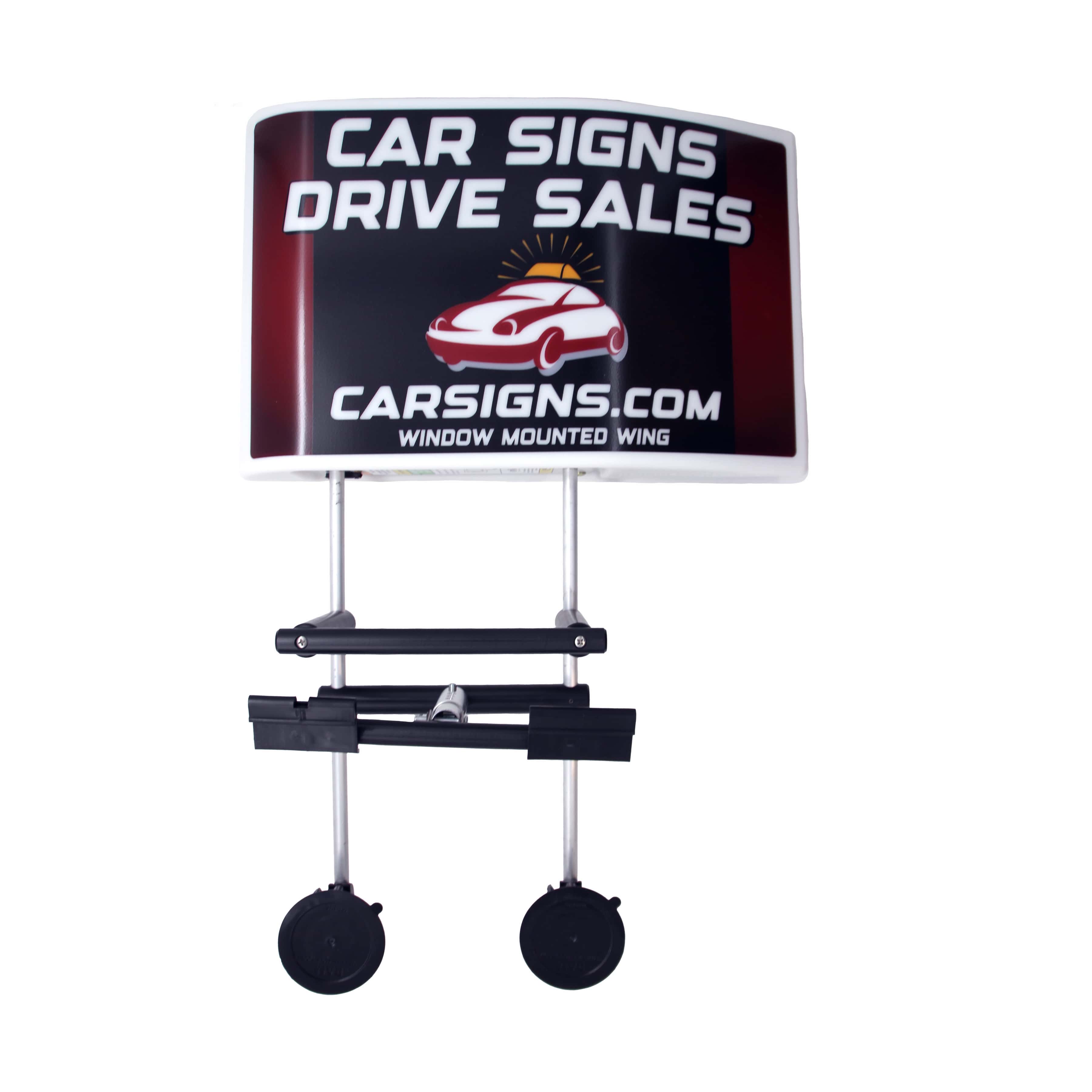
Car toppers often outperform door magnets because they’re placed at eye level for other drivers and pedestrians. Their height increases visibility from multiple angles, even in traffic or parking lots.
At HTH Car Signs, we design layouts that guide the eye smoothly. A visible sign doesn't make the viewer work—it communicates instantly.
Motion Visibility: Designing for Drivers at 40 MPH
A car moving at 30–40 mph gives viewers less than a second of reading time. This is where motion visibility science becomes essential. Busy designs fail instantly. Minimal designs succeed immediately.
The key principles include:
-
Fewer words
-
Larger letters
-
Strong contrast
-
Simplified graphics
-
No thin fonts
-
No long taglines
-
No clutter
If your customer cannot read your message in one second, the design is not visible enough.
Mobile advertising rewards clarity. Every glance matters.
Lighting Conditions: Daylight, Nighttime & Headlight Impact
Visibility changes drastically depending on lighting:
Daylight
Diffused sunlight can wash out weak colors. High-quality UV-resistant printing keeps colors sharp and vibrant, even under intense sun exposure.
Nighttime
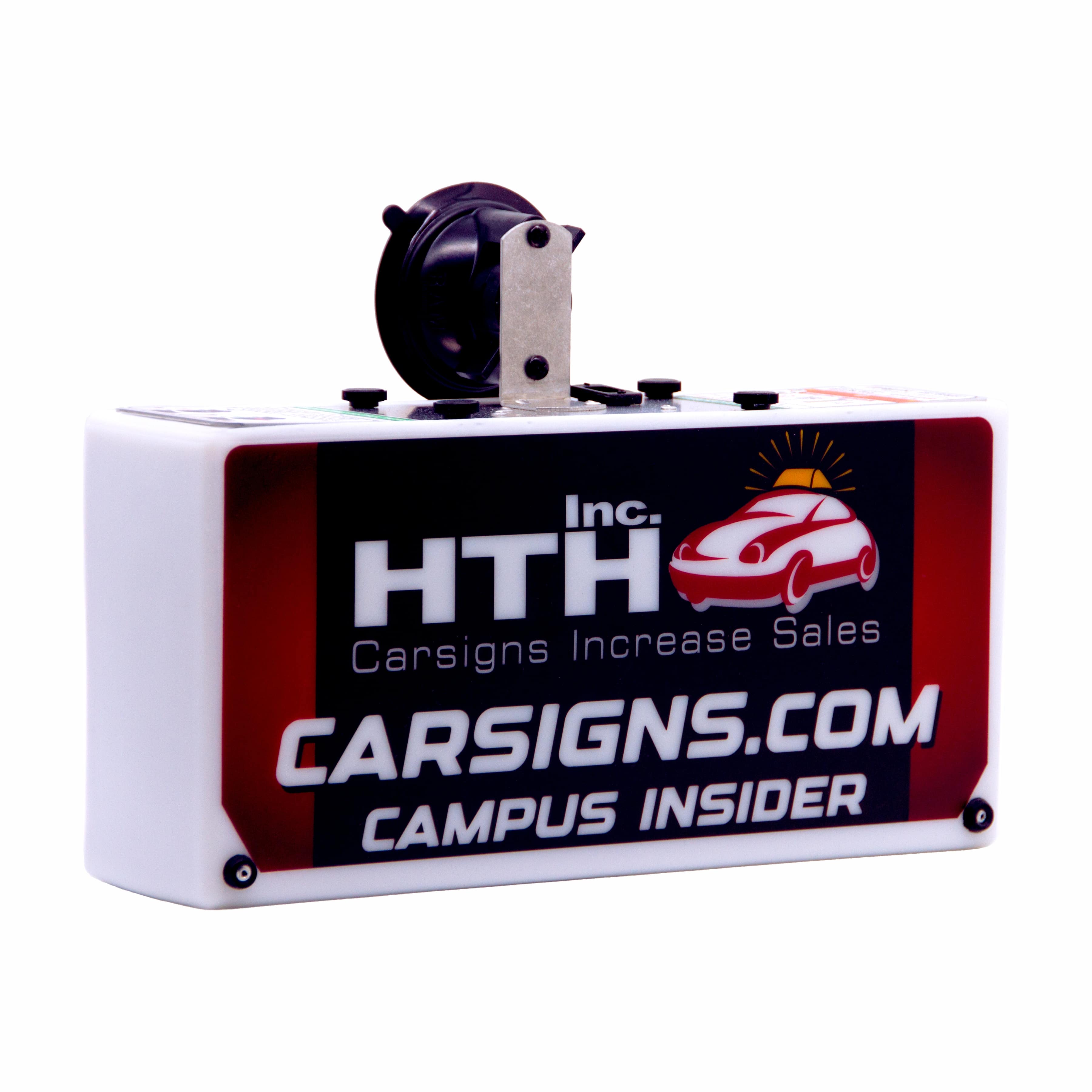
At night, reflective materials and illuminated car toppers become essential. Backlit toppers from HTH Car Signs are designed specifically to maximize nighttime visibility.
Headlights
Headlights hitting reflective surfaces dramatically improve readability. This is why reflective car magnets are a powerful upgrade for nighttime workers, delivery drivers, and taxis.
Your signage must be visible 24/7 — not just when conditions are perfect.
Placement: Where You Put Your Sign Matters
Visibility isn’t only about design — it’s about location.
The most effective areas include:
-
Driver and passenger doors
-
Rear door or tailgate
-
Roof-mounted toppers
-
Side panels of trucks and vans
-
Window-mounted signs where magnets cannot attach
Car toppers offer the widest visibility radius because they rise above traffic, street obstacles, and surrounding vehicles. They’re visible from all directions — front, back, left, and right.
Strategic placement turns your vehicle into a moving billboard with maximum impact.
Brand Recall: The Ultimate Visibility Outcome
Visibility alone isn’t enough — your message must be memorable. When your car sign uses color, contrast, clarity, and motion-friendly design, people remember your brand without trying.
Brand recall happens when:
-
The logo is clear
-
The colors are distinctive
-
The message is simple
-
The sign is consistently visible in local areas
The more often people see your sign, the more familiar and trustworthy your brand becomes. Visibility is the doorway to recognition — and recognition is the doorway to sales.
Why High-Quality Materials Matter for Visibility
Even the best design loses impact if the material fades, cracks, peels, or warps. Visibility must stay strong for years — not weeks.
Tell Us Your Idea – Contact Us
HTH Car Signs uses:
-
UV-resistant inks
-
Weatherproof laminates
-
Durable molded plastics
-
High-strength magnets
-
Anti-fade protective coatings
Cheap signs lose visibility quickly. Premium signs maintain clarity and color integrity long-term, delivering constant brand awareness.
Visibility requires longevity.
Conclusion: Visibility Is More Than Design — It’s a Science
When you apply the science of color, contrast, readability, motion perception, and material durability, your vehicle becomes a powerful marketing asset. High visibility creates opportunity. Opportunity creates recognition. Recognition creates profit.
A visible vehicle is not just transportation — it’s a mobile billboard working for you every hour of the day.
HTH Car Signs specializes in creating high-visibility signage that gets noticed, remembered, and trusted. With the right design strategy, your vehicle can dominate attention on the road and build powerful brand presence in your local community.
FAQs
1. What does “vehicle visibility” really mean?
Vehicle visibility refers to how easily people can see, read, and recognize your car signage while the vehicle is in motion or parked. It includes factors like color contrast, font size, lighting conditions, distance readability, and placement. High visibility ensures that your vehicle instantly catches attention and communicates your message in a split second — even when someone is driving past at high speed.
2. Why is visibility the most important part of car advertising?
Visibility determines whether or not your message is actually seen. A beautifully designed sign has no value if people cannot read it quickly or clearly. Mobile advertising gives you only 1–3 seconds of viewing time, so visibility directly affects brand recall, customer awareness, and the overall impact of your marketing. Good visibility equals more impressions and more potential customers.
3. What is the best color combination for high visibility on car signs?
The most effective color combinations are those with strong contrast, such as black on yellow, white on black, red on white, blue on white, or yellow on dark backgrounds. Scientifically, the human eye notices high-contrast colors faster, especially in motion. That's why road signs, emergency vehicles, and taxi toppers often use these combinations.
4. How large should text be on a car sign for maximum visibility?
The text must be large enough to be readable from a distance and in motion. As a general rule, each inch of letter height provides roughly 10–12 feet of readability. For vehicles, 3–5 inch letters work well depending on placement. Bigger fonts are easier to read at higher speeds. Avoid thin, decorative, or script fonts — bold, simple typefaces are best.
5. Why do car toppers have higher visibility than door magnets?
Car toppers sit at roof-level, which means they’re visible above parked cars, traffic, fences, and crowds. Their elevated position gives them a wider visibility radius, especially in busy streets. Many toppers are also illuminated, making them easy to spot at night. Door magnets are effective at eye level, but toppers maximize visibility from all directions.
6. How does sunlight or weather affect car sign visibility?
Heat, rain, dust, and UV rays all reduce visibility over time if the sign isn’t made with premium materials. UV exposure fades cheap prints quickly, making them dull and unreadable. Rain and moisture can cause warping or peeling. High-quality UV-resistant inks, weatherproof laminates, and durable materials ensure the sign stays bright and clear year-round.
7. Does vehicle movement make signs harder to see?
Yes — motion reduces reading time significantly. This is why mobile advertising must use bold fonts, high contrast, short text, and clean layouts. The human brain processes simple, high-contrast information faster when something is moving. Complex designs or long phrases are almost impossible to read at highway speeds.
8. How important is sign placement on the vehicle?
Placement determines the angles from which your sign can be seen. Door magnets are best for side visibility, while rear magnets or decals are ideal for drivers behind you. Car toppers deliver 360-degree visibility. Window-mounted signs work when metal surfaces aren’t available. Strategic placement ensures your message reaches as many people as possible.
9. Can poor-quality printing reduce visibility?
Absolutely. Low-quality printing fades quickly, loses sharpness, and becomes blurry with time. Cheap inks can’t withstand sunlight and weather. A faded sign blends into the environment and loses all marketing value. High-quality UV-cured or eco-solvent printing ensures long-lasting color clarity and strong visibility.
10. How do I maximize visibility if my vehicle is on the road all day?
Use bold, simple designs with strong contrast, keep text minimal, choose reflective or illuminated signs for night visibility, and place your signage where people naturally look (doors, rear, and roof). The more consistent and clear your visibility is, the more impressions and brand recall you generate every day.


0 Comments
Leave a Comment