The Role of Simplicity in Car Sign Design: Why Less Text Gets More Calls
Simplicity in Car Signage
In the fast-paced world of advertising, simplicity in car sign design can significantly enhance visibility and engagement. This article explores the critical role of minimalist design in vehicle signage, demonstrating how less text can lead to more calls and inquiries. By focusing on clear communication and effective visual strategies, businesses can optimize their car signs to capture attention and drive customer interaction. Many companies struggle with cluttered signage that fails to convey their message effectively. Embracing simplicity offers a solution that not only improves readability but also aligns with psychological principles that enhance consumer engagement. This guide will delve into the importance of simplicity, best practices for crafting concise text, factors influencing readability, strategic placement of visual elements, and methods for measuring the effectiveness of car signage.
Why Is Simplicity Crucial in Car Sign Design?
Simplicity is essential in car sign design because it enhances readability and engagement. A clear and straightforward message allows potential customers to quickly grasp the information being presented, which is crucial when signs are viewed at high speeds. Research indicates that signs with minimal text are more likely to be remembered and acted upon, leading to increased calls and inquiries. The psychological principle of cognitive load theory supports this, suggesting that reducing the amount of information presented can improve comprehension and retention. By focusing on essential elements, businesses can create impactful signage that resonates with their audience.
How Does Less Text Enhance Readability and Engagement?
Less text on car signs significantly enhances readability by allowing viewers to process information quickly. Studies show that signs with fewer words are easier to read from a distance, which is vital for vehicle advertising. For instance, a sign that simply states "Plumbing Services - Call Now!" is more effective than one cluttered with details. This clarity not only captures attention but also encourages immediate action, as potential customers can quickly understand the service offered and the call to action.
What Psychological Principles Explain the Impact of Minimalist Vehicle Graphics?
The impact of minimalist vehicle graphics can be explained through several psychological principles. Cognitive load theory posits that individuals have a limited capacity for processing information. When signs are overloaded with text or complex graphics, it can lead to confusion and disengagement. Additionally, the principle of limited attention span suggests that consumers are more likely to engage with straightforward messages that require less mental effort. By applying these principles, businesses can design car signs that effectively communicate their message and prompt action.
What Are the Best Practices for Crafting Concise Car Sign Text?
Crafting concise car sign text involves several best practices that ensure clarity and effectiveness. First, it is crucial to prioritize a clear call-to-action that directs potential customers on what to do next. Second, employing text reduction techniques, such as using abbreviations or symbols, can maximize message clarity. Lastly, utilizing a visual hierarchy in text placement helps guide the viewer's eye to the most important information first.
How to Write Clear and Effective Call-to-Action Phrases for Vehicle Signage?
To write clear and effective call-to-action phrases for vehicle signage, businesses should focus on direct and compelling language. Phrases like "Call Now!" or "Visit Us Today!" create a sense of urgency and encourage immediate response. Additionally, placing the call-to-action prominently on the sign ensures it is the first thing viewers notice, increasing the likelihood of engagement. Using action-oriented verbs and keeping the message short and impactful are key strategies for effective signage.
Which Text Reduction Techniques Maximize Message Clarity on Moving Cars?
Text reduction techniques that maximize message clarity on moving cars include the use of abbreviations, symbols, and a focus on essential information. For example, instead of writing "Emergency Plumbing Services Available 24/7," a more concise version could be "24/7 Plumbing Help." This approach not only saves space but also makes the message easier to read at a glance. Additionally, employing a visual hierarchy, where the most critical information is larger and bolder, can further enhance clarity and impact.
How Do Readability Factors Influence Effective Vehicle Signage?
Readability factors play a crucial role in the effectiveness of vehicle signage. Key elements such as font choice, size, color contrast, and spacing all contribute to how easily a message can be read from a distance. Ensuring that the text is legible and stands out against the background is essential for capturing attention.
What Fonts and Sizes Ensure Legibility from a Distance?
Choosing the right fonts and sizes is vital for ensuring legibility from a distance. Sans-serif fonts, such as Arial or Helvetica, are often recommended for their clean lines and simplicity. Additionally, using larger font sizes—typically at least 2 inches high for main text—is advised to ensure that the message can be read easily by passing motorists. Consistency in font style and size across the sign also contributes to a cohesive and professional appearance.
How Do High-Contrast Colors and Strategic White Space Improve Car Sign Visibility?
High-contrast colors and strategic use of white space significantly improve car sign visibility. For instance, using dark text on a light background or vice versa enhances readability. Furthermore, incorporating ample white space around text and graphics prevents the sign from appearing cluttered, allowing the viewer to focus on the message. This design strategy not only makes the sign more visually appealing but also aids in quick comprehension.
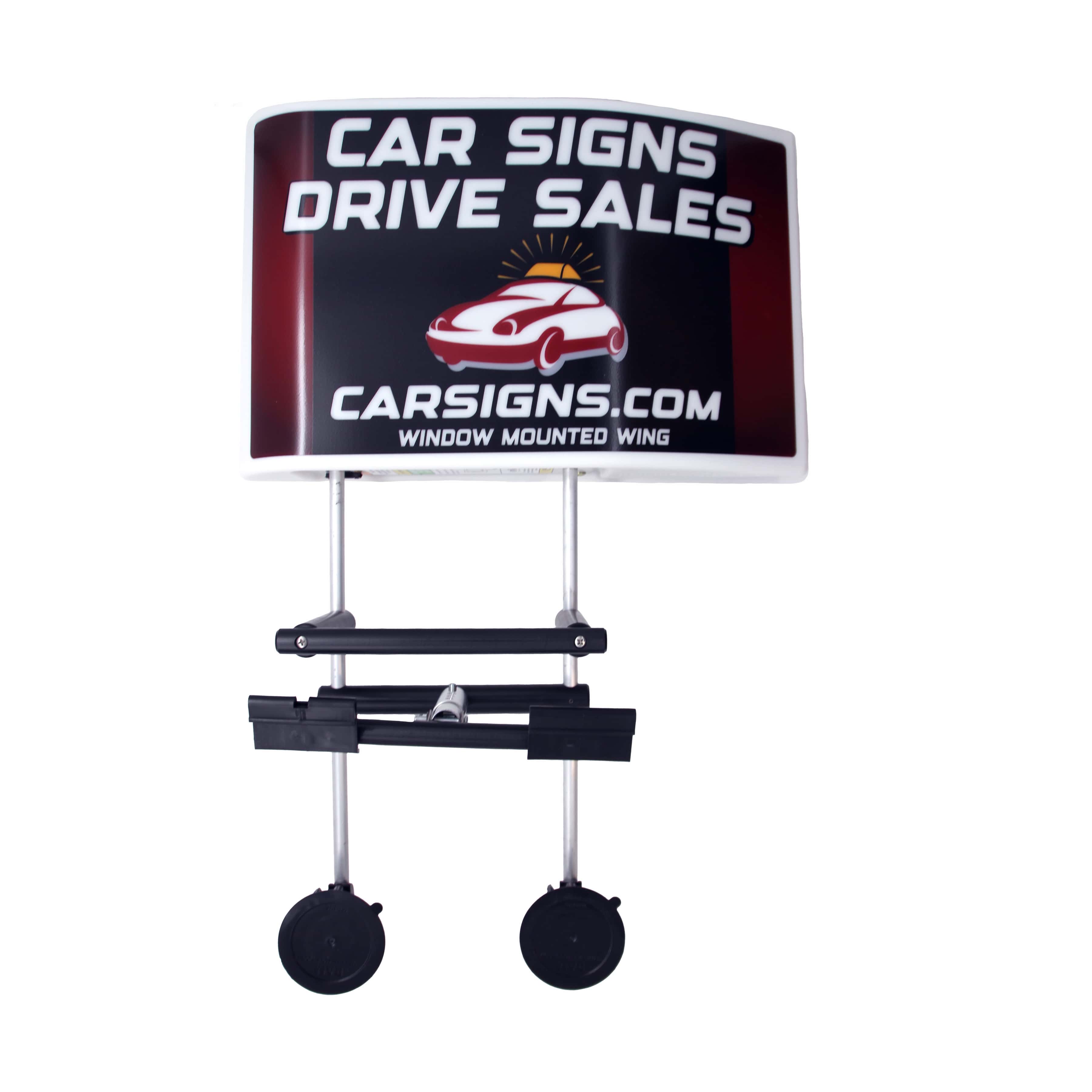
Where Should Visual Elements Be Placed for Maximum Impact on Car Signs?
The placement of visual elements on car signs is crucial for maximizing impact. Strategic positioning can draw attention to key messages and enhance overall design effectiveness. Understanding how different vehicle types may require varied approaches to visual placement is essential for optimal results.
How Does Strategic Placement Vary Across Different Vehicle Types?
Strategic placement of visual elements can vary significantly across different vehicle types. For example, on a compact car, placing graphics on the sides may be more effective, while larger vehicles like vans can utilize the back and sides for more extensive messaging. Additionally, considering the vehicle's movement and the typical viewing angles can inform where to position key information for maximum visibility.
What Role Do Compelling Imagery and Branding Play in Minimalist Car Sign Design?
Compelling imagery and branding play a vital role in minimalist car sign design by enhancing brand recognition and creating a memorable impression. High-quality images that align with the brand's message can capture attention and evoke emotions, making the sign more effective. Balancing text and visuals is essential; too much imagery can detract from the message, while too little can make the sign forgettable. A well-designed sign integrates both elements harmoniously to reinforce brand identity and drive engagement.
How Can Businesses Measure the Marketing Effectiveness of Simple Car Signage?
Measuring the marketing effectiveness of simple car signage involves tracking key performance indicators (KPIs) that reflect engagement and lead generation. Businesses can utilize various methods to assess the impact of their signage on customer inquiries and conversions.
Which Key Performance Indicators Track Calls and Lead Generation from Vehicle Signs?
Key performance indicators for tracking calls and lead generation from vehicle signs include the number of calls received, website visits, and inquiries generated within a specific timeframe. Businesses can implement unique phone numbers or QR codes on their signs to facilitate tracking. Analyzing these metrics helps determine the effectiveness of the signage and informs future design decisions.
What Case Studies Demonstrate Increased Calls Through Less Text Car Signs?
Several case studies illustrate the effectiveness of less text on car signs in driving increased calls. For instance, a local plumbing company that simplified its vehicle signage from a detailed description to a straightforward "24/7 Plumbing Help" saw a 20-30% increase in call volume within the first month. Another example includes a landscaping business that adopted minimalist graphics and concise messaging, resulting in a 20-25% boost in customer inquiries. These real-world examples highlight the tangible benefits of embracing simplicity in car sign design.
| Design Element | Impact on Engagement | Example |
|---|---|---|
| Minimal Text | Increases readability and recall | "24/7 Plumbing Help" |
| High Contrast Colors | Enhances visibility | Dark text on light background |
| Strategic White Space | Prevents clutter, improves focus | Ample space around text |
This table summarizes how specific design elements contribute to enhanced engagement and effectiveness in car signage, reinforcing the importance of simplicity in design.
In conclusion, embracing simplicity in car sign design is not just a trend but a strategic approach that can lead to increased customer engagement and calls. By focusing on clear messaging, effective visual strategies, and measurable outcomes, businesses can optimize their vehicle signage for maximum impact. The principles discussed in this article provide a roadmap for creating effective car signs that resonate with audiences and drive results.