
Mistakes to Avoid When Designing Car Magnets
Mistakes to Avoid When Designing Car Magnets: The Complete Guide to High-Visibility Vehicle Advertising
Car magnets are one of the most affordable, effective, and versatile advertising tools available for small businesses, contractors, delivery drivers, and service companies. They are removable, easy to install, weather-resistant, and constantly visible wherever you drive. But their effectiveness depends entirely on one thing:
Good design.
A perfectly placed car magnet can bring in calls, boost brand trust, and increase visibility across your community — but a poorly designed magnet can get ignored, blend into the background, or even create a negative perception of your business.
The problem isn’t the magnet itself.
It’s the design mistakes businesses unknowingly make.
A car magnet must catch attention in seconds, be readable from a distance, and communicate your message instantly — even when the viewer is driving past you at 40 mph. That requires strategic design, color science, strong contrast, correct sizing, material quality, and layout decisions that maximize impact.
In this guide, we break down the most common mistakes businesses make when designing car magnets, why they cost visibility (and revenue), and how to create magnets that turn every mile you drive into meaningful advertising impressions.
Why Design Mistakes Ruin Car Magnet Visibility
Car magnets have limited time to connect with a viewer. Whether you’re at a traffic light, in a parking lot, or passing by on the highway, your magnet has 1–3 seconds to communicate:
-
who you are
-
what you do
-
how to contact you
But when design mistakes get in the way — small text, weak contrast, poor color choices, clutter, or confusing layouts — the magnet becomes ineffective, even if it’s technically on your vehicle.
A magnet’s purpose is not decoration.
It is a visibility tool.
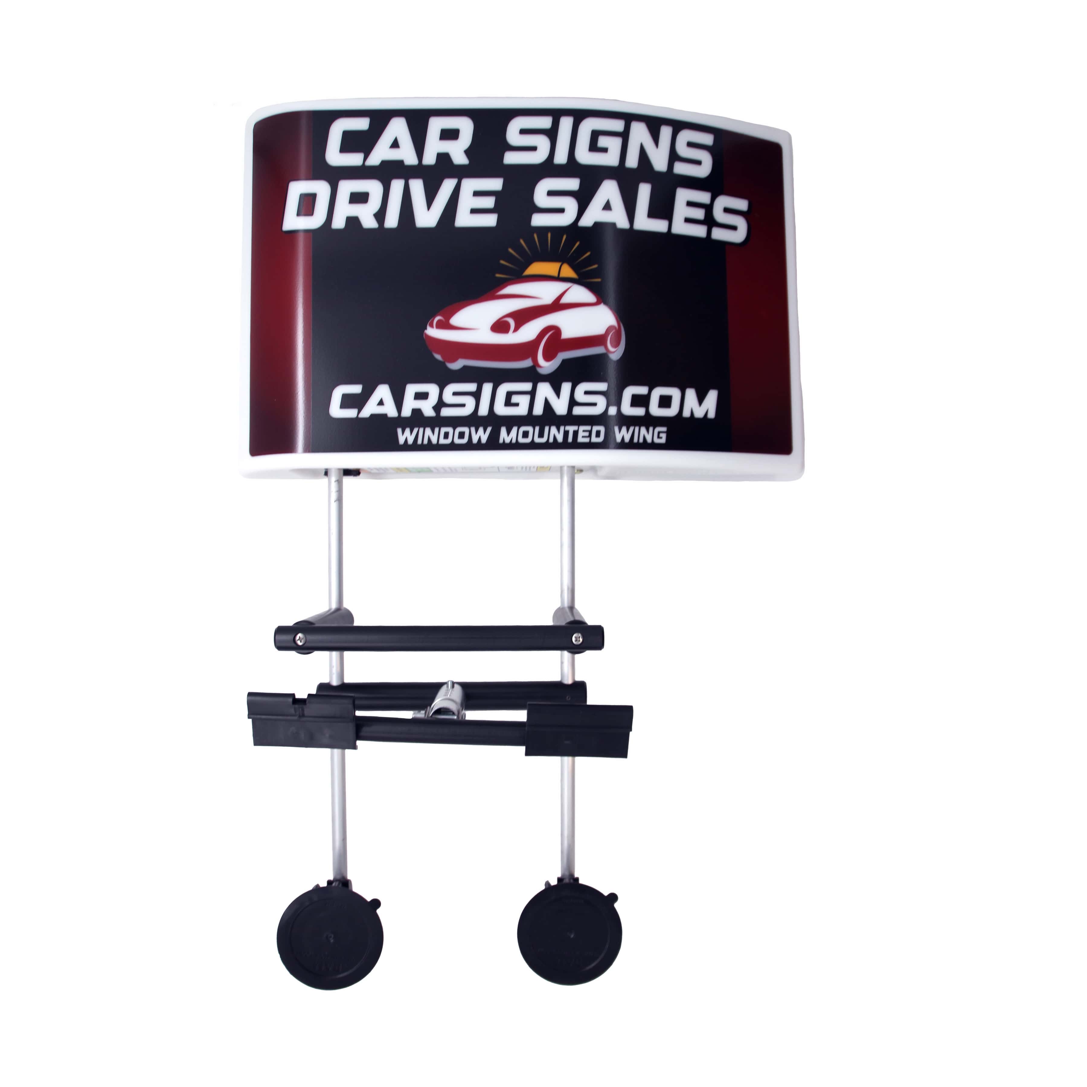
Discover Top-Rated Car Topper Signs
Every design decision should be intentionally crafted to support legibility, visibility, and brand recognition.
Let’s explore which mistakes hurt performance the most — and how to avoid them.
1. Using Small Fonts That Can’t Be Read From a Distance
One of the biggest mistakes in magnet design is choosing fonts that are too small, too thin, or too decorative.
Here’s the truth: If people cannot read your magnet in one second, the design has failed.
Many businesses try to fit too much text, and the font size suffers as a result. But the average person on the road has almost no time to process details.
Recommended Letter Height for Car Magnets
-
3" letters → readable from 30–40 feet
-
4" letters → readable from 50–60 feet
-
5–6" letters → readable from up to 100 feet
If your phone number or business name is smaller than 2–3 inches, it becomes nearly invisible to drivers.
Good rule:
If you have to squint to read it on screen, it will not be readable on the road.
2. Cluttered Layouts With Too Much Information
Another major mistake is overcrowding the magnet with:
-
full service lists
-
slogans
-
long taglines
-
multiple fonts
-
unnecessary icons
-
too many contact options
A car magnet is not a brochure.
It’s a moving billboard.
You must prioritize simplicity and clarity. The magnet should display only the essential details:
-
business name or logo
-
main service or category
-
phone number or website
That’s it.
The more information you add, the less the viewer absorbs. Clutter destroys visibility because the brain can only process a limited amount of visual information at high speeds.
Minimal design = maximum impact.
3. Weak Color Contrast That Blends Into the Vehicle
Bad color contrast is one of the most damaging design mistakes because it makes the magnet invisible even when the layout is perfect.
If the background and text colors are too similar, nothing stands out.
High-Contrast Combinations That Always Work:
-
Yellow on black
-
Black on yellow
-
White on blue
-
White on red
-
Red on white
-
Black on white
Weak Combinations That Fail:
-
Light blue on white
-
Gray on black
-
Red on dark red
-
Yellow on white
-
Green on blue
High contrast is the core of visibility science.
The human brain identifies bold, high-contrast colors instantly — especially at a distance or in motion.
If customers can’t read your magnet from 50–100 feet away, the contrast is too weak.
4. Using Script, Thin, or Decorative Fonts
Decorative fonts may look stylish on a computer screen, but they are a disaster on car magnets. Thin fonts disappear in sunlight or at angles. Script fonts become unreadable in motion. Fancy styles slow the brain down.
Avoid:
-
Cursive fonts
-
Calligraphy
-
Extra-thin fonts
-
Novelty fonts
Use:
Bold, simple, block-style fonts designed for distance visibility:
-
Impact
-
Helvetica Bold
-
Arial Black
-
Bebas Neue
-
Montserrat Extra-Bold
A magnet must be readable instantly.
Legibility beats style — every time.
5. Poor Magnet Size Selection
Many businesses choose magnets that are too small for their type of vehicle or too small to fit readable text.
Common mistakes:
-
Small magnets on pickup trucks
-
Small magnets on vans
-
One magnet only (instead of pair for both sides)
-
Choosing a size based on price instead of visibility
Recommended sizes:
-
Cars: 12" × 18"
-
SUVs: 12" × 24"
-
Pickup trucks: 18" × 24"
-
Cargo vans: 24" × 36"
Visibility increases dramatically with size.
Choosing a size too small reduces ROI, impressions, and readability.
6. Low-Quality Printing That Fades or Blurs Over Time
Cheap magnets fade quickly under UV exposure and lose their sharpness. Colors become washed-out, details blur, and the magnet becomes unprofessional-looking.
This directly hurts visibility and brand credibility.
Premium car magnets should use:
-
UV-resistant inks
-
Weatherproof lamination
-
Heavy-duty outdoor vinyl
-
Fade-resistant pigments
A faded magnet blends into the vehicle and becomes worthless as advertising.
Investing in premium print quality ensures your magnet stays crisp for years — not months.
7. Overusing Images, Icons, and Graphics
A magnet is not a flyer. Every extra graphic reduces readability. While one small icon can help (like a wrench for a handyman), many icons create clutter.
Big photos, detailed graphics, and overly artistic layouts distract from your core message.
The focus should always be on:
-
business name
-
service
-
contact information
Everything else is optional.
8. Not Matching the Magnet Colors to the Vehicle Color
A black magnet on a black car?
A red magnet on a red car?
White magnet on a white car?
This mistake makes the car magnet blend into the vehicle instead of standing out from it.
Your magnet must visually contrast with your vehicle’s paint.
If your car is dark:
→ Use bright, bold magnets (yellow, white, orange, bright blue)
If your car is light:
→ Use darker magnets (black, deep blue, red)
A magnet should NEVER match the vehicle color.
9. Ignoring the Science of Motion Visibility
Car magnets must be readable at speeds of 20–40 mph. That means:
-
minimal text
-
high contrast
-
big fonts
-
simple layouts
-
clean spacing
Complex designs collapse under motion blur.
Great magnet design respects the science of how the human eye reads moving objects.
10. Not Testing the Magnet Before Printing
Many businesses skip testing the design by printing a quick sample and viewing it from:
-
20 feet
-
50 feet
-
100 feet
This simple test helps you spot mistakes instantly.
If you can’t read it from 50+ feet, your customers can’t either.
Testing prevents costly redesigns and ensures your magnet works in real-world conditions.
Conclusion: Visibility is Strategy — Not Decoration
A car magnet is one of the most cost-effective advertising tools available — but only when it’s designed correctly. Poor design leads to poor visibility, lower impressions, and missed revenue.
When you avoid the common mistakes listed in this guide, your magnet becomes:
-
clearer
-
more readable
-
more eye-catching
-
more professional
-
more effective at generating calls
-
more memorable in your community
A high-visibility magnet turns every mile you drive into advertising value.
A poorly designed magnet turns into wasted space.
If you want your magnet to work like a mobile billboard — simplicity, clarity, and contrast are everything.
FAQs: Mistakes to Avoid When Designing Car Magnets
1. What is the biggest design mistake people make with car magnets?
The most common mistake is using text that is too small to read from a distance. Fonts under 2.5 inches are nearly invisible at driving speeds.
2. How many words should a car magnet have?
Ideally under 7–10 words. Short text increases readability and recall.
3. What colors work best for high visibility?
High-contrast pairs like yellow/black, black/yellow, white/blue, and red/white.
4. Should I include my full list of services on the magnet?
No. It creates clutter. Use only your main service category.
5. Can I use a script or decorative font?
Avoid them. Stick to bold, simple fonts made for long-distance readability.
6. What magnet size works best?
For most cars: 12" × 18". For trucks and vans: 18" × 24" or larger.
7. Why is high-quality printing important?
Cheap prints fade quickly in sunlight. Premium UV-resistant prints maintain visibility long-term.
8. Should I match my magnet color to my car color?
No. It reduces contrast. Always choose a contrasting background color.
9. Can too many images hurt the design?
Yes. Even one unnecessary graphic can reduce readability.
10. How can I test the visibility before printing?
Print a small mockup, tape it to your car, and view it from 50–100 feet away.


0 Comments
Leave a Comment