
How to Design Car Signs That Get Noticed Instantly
At any red light, drivers glance up from their dashboards, scanning the stream of vehicles for something that breaks the monotony—a flash of bold color, a crisp message, a logo they recognize. Research shows you have less than three seconds to catch their attention and make your brand stick. Designing car signs that get noticed instantly isn’t guesswork; it’s about applying proven layout, color, and messaging principles that work at 40 mph or from a parking lot away.
Whether you’re considering car topper signs for delivery fleets or magnetic car signs for service vehicles, the right design can mean the difference between a wasted investment and a rolling billboard that delivers up to 10,000 daily impressions. Here’s a step-by-step guide, based on over four decades of in-field results, to ensure your vehicle signage stands out in any traffic, weather, or lighting condition.
Why Vehicle Signage Outperforms Digital Ads for Local Businesses
Unlike digital ads that disappear with a swipe or get lost in inboxes, car top signs and door magnets achieve constant exposure within your service area. One-time costs deliver lifetime advertising, with no ongoing fees or algorithm shifts. In regions with unpredictable weather, from icy winters to blazing summers, high-quality signs withstand the elements—ensuring your message is visible rain or shine. That’s why franchise partners like Pizza Hut and Jet’s Pizza have relied on HTH Car Signs’ patented designs for decades: the visibility is automatic, and the impressions are real, not just digital estimates.

Designing for the Three-Second Glance: Layout and Message Hierarchy
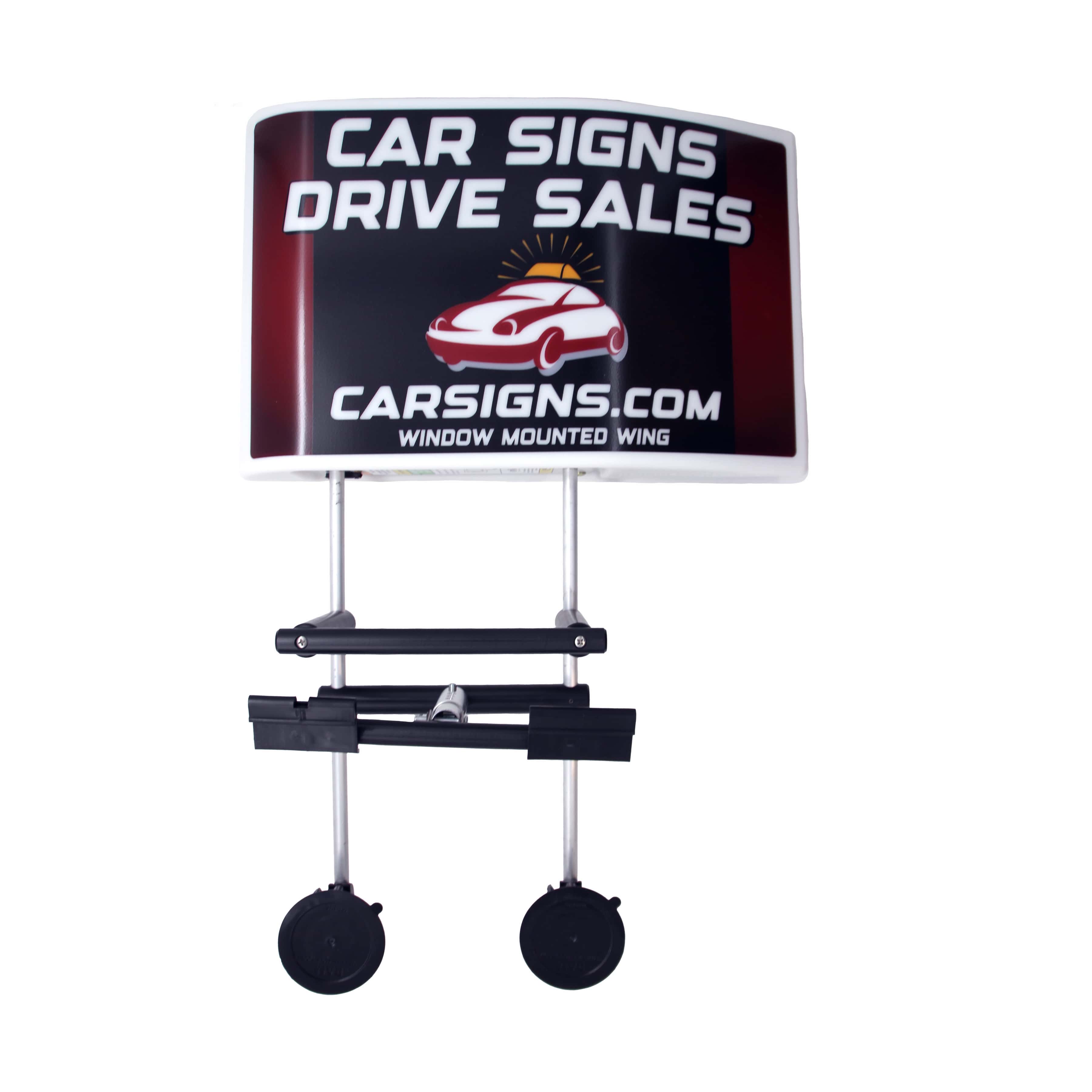
Effective car signs start with ruthless clarity. Drivers don’t read—they scan. Prioritize your information: brand name, core service or offer, and a way to connect. The brand should dominate, positioned at the top or center. Use a single, bold line for your main service (“Plumbing,” “Pizza Delivery”) beneath the logo. Reserve secondary details—like a phone number or website—for the bottom line, in a slightly smaller font.
Avoid clutter. Every extra word or graphic dilutes impact. Franchise collections like those used by Hungry Howie’s prove that the most successful signs often contain no more than three lines of text. If you must include a call-to-action, keep it short and direct: “Call Now” or “Order Online.”
Color Contrast and Font Choices: The Science Behind Readability
High-contrast color schemes are non-negotiable. White text on a dark blue or black background, or black text on a bright yellow, ensures maximum legibility from a distance. Avoid gradients and subtle shades—they may look appealing up close but lose clarity on the road.
Font selection matters as much as color. Stick to bold, sans-serif typefaces—think Helvetica, Arial, or HTH’s own proprietary fonts developed for car topper signs. Avoid script or decorative fonts, which blur at speed or in low light. For magnetic car signs, a font height of at least three inches is optimal for readability at typical traffic distances.
Brand Consistency and Local Relevance
Your vehicle signage should match your storefront, website, and print materials. Consistent use of logos, colors, and taglines strengthens recall. In communities where word-of-mouth and visual recognition drive business, this consistency is your silent sales force. If your region experiences heavy rain or snow, opt for UV-resistant and weatherproof materials—HTH offers easy stick vinyl and car toppers engineered for durability, proven by decades of Midwest and coastal use.
For franchisees, alignment with national branding is essential—but localizing with a neighborhood phone number or regional offer can boost responses. When in doubt, test two variations and track response rates over a month.
Practical Tip: The “10-Second Test” for Every Car Sign Design
Before finalizing any design, print it at actual size and tape it to your vehicle. Step back 30 feet—the average distance in a parking lot. Give yourself 10 seconds, then answer:
- Is the main message (brand and service) immediately clear, even without reading every word?
- Is the contact method readable at a glance, not just up close?
- Does the color and font combination remain sharp in both sun and shade?
If any answer is “no,” refine your layout or color choices. This real-world test reveals issues that digital mockups often miss.
Conclusion: Make Every Impression Count with Smart Car Sign Design
Designing car signs that get noticed instantly isn’t about being loud—it’s about being clear, consistent, and readable in every situation. With over 40 years of expertise and industry-leading solutions like fridge magnets, car toppers, and magnetic signs, HTH Car Signs helps businesses turn vehicles into high-impact advertising—once, for a lifetime. Explore our ROI calculator or connect with our team at carsigns.com to see what your fleet is truly capable of achieving.


0 Comments
Leave a Comment