
10 Car Sign Design Mistakes That Kill Visibility (And Fixes)
Most small business owners are surprised to find out that a vehicle sign can collect up to 10,000 daily impressions—yet only a fraction of those viewers will actually notice your brand if the design isn’t right. The difference between a car sign that generates calls and one that fades into traffic often comes down to a handful of avoidable design errors. Below, we break down the most common car sign design mistakes that reduce visibility (and fixes), helping you turn every drive into a true advertising opportunity.
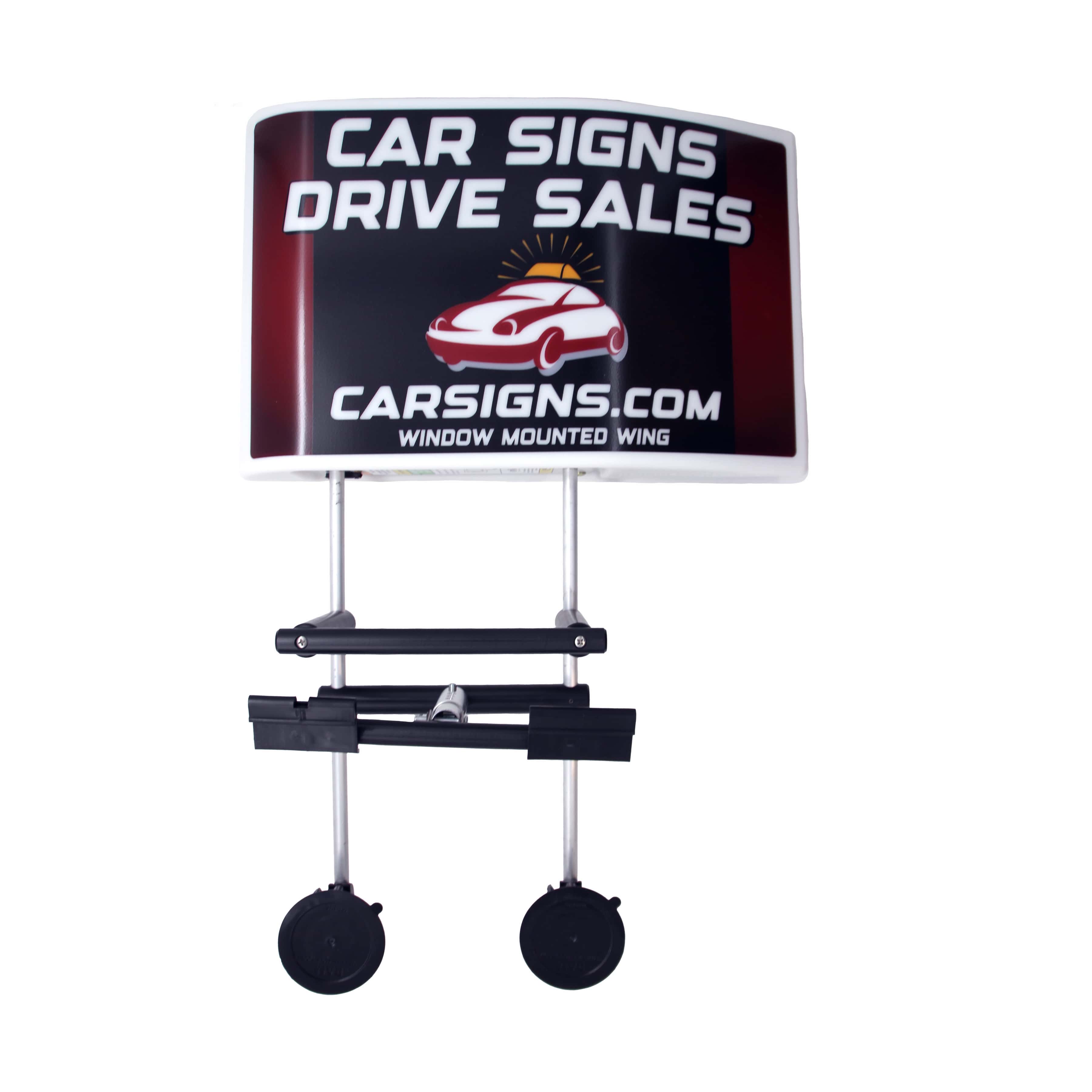
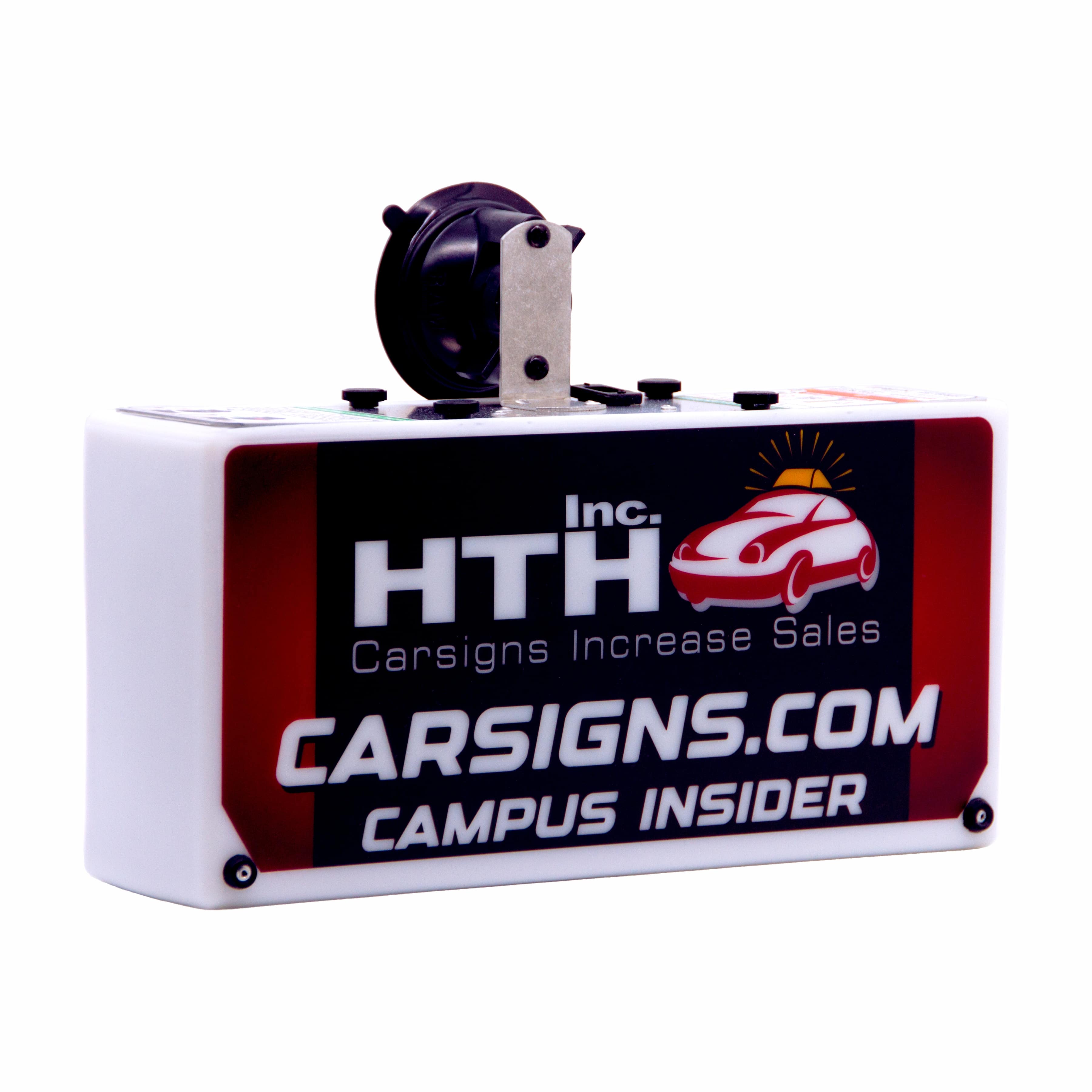
Whether you’re running a single pizza delivery car or a service fleet, your signage is your moving billboard. Here’s how to make sure it’s doing the heavy lifting, with practical fixes drawn from four decades of industry experience at HTH Car Signs.
How Poor Font Choices Undercut Readability
Font selection is often underestimated, yet it’s one of the fastest ways to lose a potential customer’s attention. Script fonts, fancy serifs, or anything overly stylized may look “unique” on a screen but blur into illegibility at 35 mph. Even bold fonts can backfire if they’re too condensed or stretched, causing letters to run together or distort.
The fix: Stick to bold, sans-serif fonts with clear shapes like Helvetica or Arial Black. Avoid italics and excessive capitalization—both reduce legibility from a distance. For car toppers and door magnets, test your chosen font at the actual size and view it from 30 feet away before finalizing. This simple step can reveal readability issues that aren’t obvious on a computer monitor.
Why Weak Contrast Makes Your Message Disappear
One of the top car sign design mistakes that reduce visibility (and fixes) comes down to poor color contrast. If your text and background are too similar—think navy blue on black, or red on dark gray—your message will vanish in low light or rainy conditions, both common in many U.S. regions. Sun glare can also wash out pale colors, especially on vinyl or plastic surfaces.
Solution: Use high-contrast color pairings. Black text on a white background, or yellow on dark blue, consistently perform best for visibility. At HTH, our patented designs for franchise partners like Jet’s Pizza and Hungry Howie’s always prioritize color contrast, ensuring the brand stands out whether it’s sunny or stormy outside.
The Dangers of Cluttered Layouts and Overloaded Signs
Trying to squeeze every service, phone number, and social handle onto your vehicle is tempting, but it’s one of the most frequent car sign design mistakes that reduce visibility (and fixes). A cluttered sign overwhelms the eye, making it hard for drivers or pedestrians to catch the most important detail—how to contact you.
Prioritize a single, clear call to action. For example, a car topper for Marco’s Pizza might display just the logo and a phone number, rather than adding the full menu or multiple taglines. Leave generous margins around text and stick to one or two key pieces of information. For door magnets and easy stick vinyl, less truly is more: the best designs feature a logo, a short tagline, and a large phone number—no more.
Ignoring Regional Weather and Material Durability
Design isn’t just about what’s on the sign—it’s also about how long it lasts. In many parts of the U.S., harsh winters, sun exposure, or torrential rain can fade colors, peel vinyl, or cause magnets to warp. A sign that looks sharp in the shop may become unreadable after a single season if the materials aren’t chosen with local conditions in mind.
The fix: Choose UV-resistant inks and weatherproof materials. HTH’s in-house manufacturing uses processes tested over decades of Midwest and coastal weather, so signs don’t just look good on day one—they stay crisp for years. For franchises and independents alike, this means a one-time cost for lifetime advertising, not a recurring headache.
One Actionable Recommendation: The 10-Second Test
Before approving a design, print it at full size and tape it to your vehicle. Then, have someone drive past—if they can’t read the business name and phone number in under 10 seconds, revise the layout. This real-world test catches issues that digital previews miss, especially for moving vehicles or signs viewed in motion.
- Use a bold, sans-serif font at least 3 inches tall for car toppers and door magnets.
- Limit the message to two main elements: brand/logo and contact method.
- Choose high-contrast colors proven to withstand sun and rain.
The right car sign design turns your vehicle into a high-ROI advertising tool that works every mile. Avoiding these common mistakes ensures your message isn’t just seen—it’s remembered. For expert guidance or to calculate your potential impressions and ROI, visit carsigns.com or call (800) 321-1850. Your next customer could be in the lane beside you.


0 Comments
Leave a Comment